In relation to his paintings and drawings, Willi Baumeister’s graphic print oeuvre occupies a modest space within his total production. Nonetheless, the artistic significance of the approximately 150 lithographs, about 70 serigraphs, 9 etchings, and slightly fewer woodcuts and linocuts is undisputed. Many themes and phases of his artistic development recur in these prints, upon which the great interest among collectors has also been established.
Genuine and Independent
Baumeister brought some inventions to even greater perfection in his graphic works than in his paintings. As in the case of the drawings, the original graphics produced by Baumeister in lithography, etching, or silkscreen are seen as genuine and independent works of art.
The special character of the graphic works is particularly expressed where he varied and paraphrased the paintings’ thematic and formal realms in the serigraphs and lithographs and thereby arrived at autonomous results.
Art for Everyone
Apart from the artistic aims, the print editions also allowed Willi Baumeister to pursue the goal of making his art accessible to a broader circle of enthusiasts who were of more modest means. Here he was part of a 500 year-old tradition that maintains its high rating today.
Not all works, however, were produced in a complete edition of between 50 and 100 copies. Some only exist as proofs and of others there are only a few copies.
Lithograpy
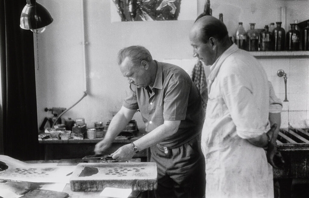
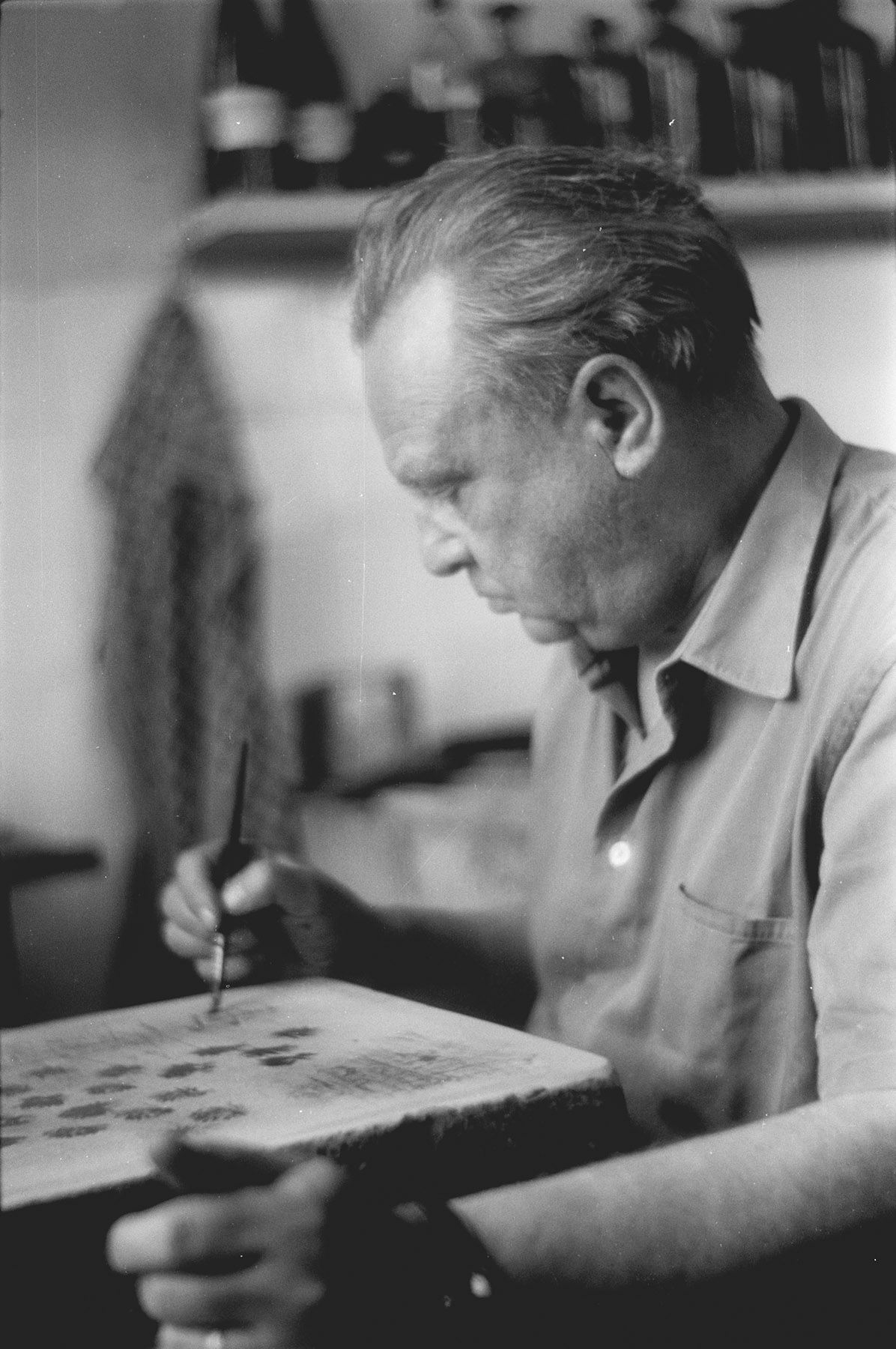
Between 1919 and 1943 lithography (along with the related offset printing) was the only original graphic printing method that Willi Baumeister used. By 1955 he had produced a total of 150 leaves that, in addition to the paintings, contribute important accents to the corresponding work phase.
Since at least in the initial years he achieved little definite character by chance in his works, he largely rejected the woodblock and linocut techniques as well as etching.
Clear and Consolidated: The Early Works
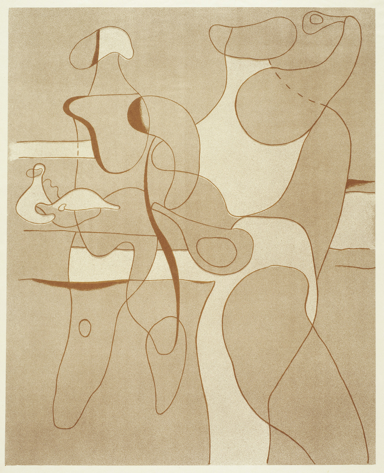
He endowed the earliest lithographic leaves of 1919 to 1922 with the tersest of pictorial means (e.g. Figure, 1920 — Apollo, 1922). For him, strokes and shading entirely in black on toned paper were the appropriate forms of expression for the desired abstraction of the human figure and structuring of the picture surface.
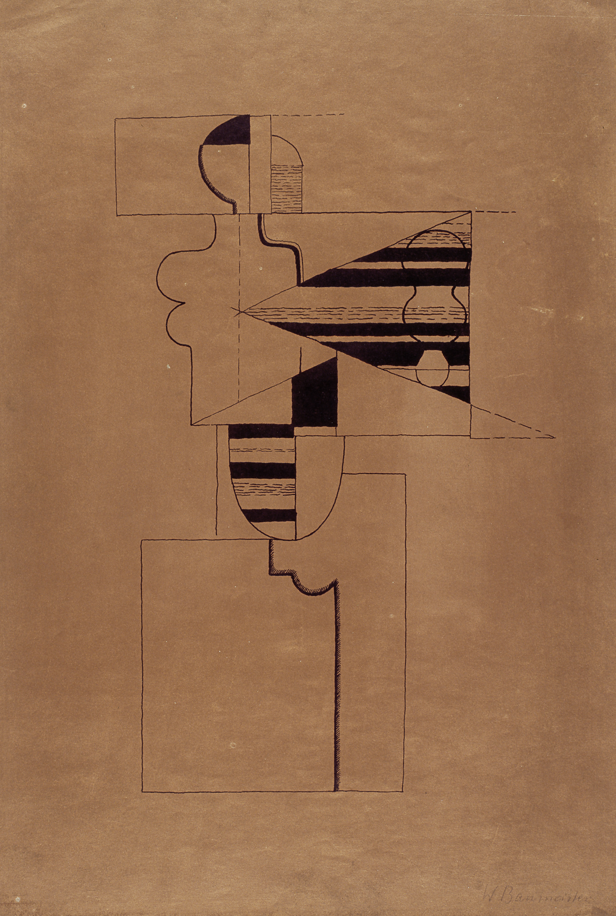
He translated the characteristic materiality that preoccupied him in the Wall Pictures during these years into the lithograph, using shading, scored and blackened surfaces, and thin and amplified outlines. This resulted – even more so than in the drawings – in clear, formally extremely consolidated compositions.
The earliest preserved chromolithography, “Figure and Circular Segment”, dates from 1925 and remained the only one until 1936.
More Flowing Forms and Stronger Abstraction
Only a few lithographs are preserved from the Frankfurt period between 1928 and 1933 (e.g. Athletes at Rest, 1928).
We know from the drawings that Baumeister destroyed numerous of his athlete renderings because they later appeared too naturalistic to him. We might presume the same here, too, although it was no doubt chiefly a lack of time that kept him from making lithographs. He increasingly turned to the technique again around 1934, after losing his teaching position.
In contrast to the geometricized figures of the 1920s, he was now interested in movement, without losing the extreme reduction of the drawing. Between 1934 and 1937, the intensified use of graduated tonal values, an even clearer surface emphasis (Tennis Players, 1935 — Painter, 1935/36) and a drawn quality bordering on the nonrepresentational (Line Figure, 1937) characterized the graphic works.
Marking the end of this phase are a few Line Figures and compositions that Baumeister called Formlings and whose kinship with the Ideograms in the paintings is apparent.
Painting Prohibition
In the years after the Munich Degenerate Art, in which pictures by him were also shown, and after he was imposed with a ban on painting and exhibiting, Baumeister produced further lithographs. Alongside the lack of materials, the circulation of graphic works would have meant an additional danger.
After World War II
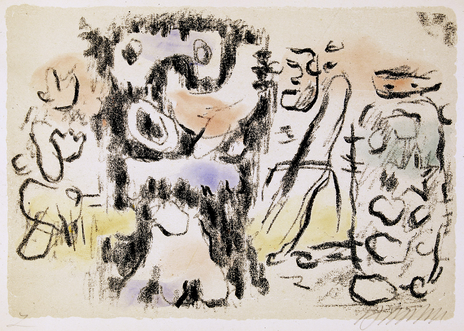
In 1946 Baumeister produced the 12-lithograph portfolio “Salome and the Prophet” in which he published a few of the 1943 Biblical illustration series drawings. He certainly retained the motifs from the wartime sketches, although formally he worked out even clearer compositions and figurations that, in regard to a circulation of the portfolios, was also understandable and sensible.
In two other portfolios of 1946 and 1947, he likewise took motifs from previous years’ drawings, including scenes from Africa, Figure Walls, and other abstract, chiefly figural renderings.
Primary colors as well as green now emerged in some leaves again in the form of watercolored Islands that concurrently appeared in many paintings and silkscreen prints (e.g. Primordial Forms, 1947). But even without the use of color, Baumeister realized works with highly nuanced tonal values by using blurring, chalk structures, and the frottage technique.
The Engagement with Surface and Color
In the last years Baumeister turned more strongly to the serigraph which offered him a much broader opportunity to produce color graphic works. By contrast, he largely avoided intense coloration in the lithographs and increasingly worked with light tonal plates and a grainy lithography stone to reduce contrasts.
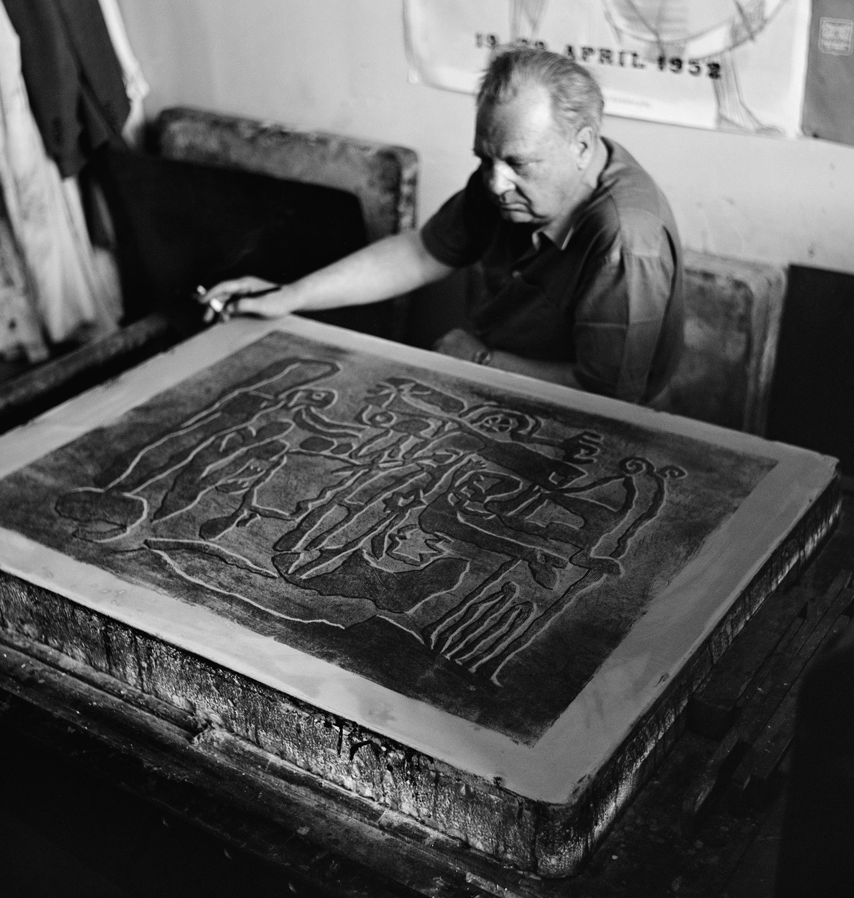
The leaves “Crucifixion” (1952) and “Safer” (1953) most closely correspond to the artist’s intention. At that time he could also make the desired relief structures in lithograph with the means mentioned above. Now it was even possible for him to translate the use of sand in his paintings into the language of the graphic print.
The monumental “Crucifixion” represents a climax in Baumeister’s lithographs. It is the largest graphic print of all and of great suggestive power. Here the print is in no way inferior to the corresponding painting of the same year.
Pleasure in Experimenting
In the last lithographs dealing with the “Aru” and “Han‑i” themes, which Baumeister only made into an edition as an exception, he experimented with cutout stencils. This again reveals that he constantly searched for new ways to realize his artistic intentions. In the two Stuttgart printers, Erich Mönch and Luitpold Domberger, he had also found two congenial partners.
Etching
The etching as well as other etch (= eaten) and incising techniques play no appreciable role in Willi Baumeister’s graphic print work. Merely nine known works exist – three apiece from 1943, 1947, and 1952.
The older ones (e.g. Dialog OMBU and Relief Figures in Dialogue, both 1947) are directly linked to the illustration series on which Baumeister worked during the last war years and shortly thereafter and which survive in extensive drawings and lithographs.
The more recent leaves deal with attempts to translate line figurations, planar compositions, and tonal structures into the language of etching. He was obviously dissatisfied with the results (e.g. Montaru, 1952).
In all cases these are undoubtedly the artist’s attempts – experiments that he did not pursue further. We can assume that the individual stroke lines bothered him and in particular, that the effects he was able to achieve in other original graphic techniques and in painting were not satisfactory in etching. As such, only a few examples of each of the existing works were also printed.
The aquatint technique would have undoubtedly offered him better artistic possibilities, but presumably there was no suitable intaglio workshop available to him. In particular, serigraphy, which Baumeister discovered around 1950, seemed considerably better suited to him in every respect.
Serigraphy
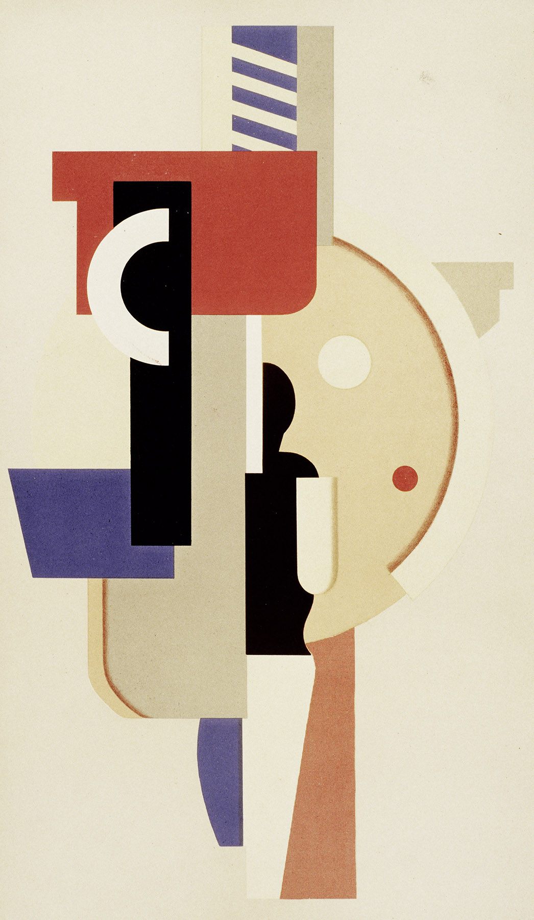
Through exhibitions at the America Houses the silkscreen print technique became known in Germany after World War II. Willi Baumeister first visited one such exhibition in 1948 and recognized that some of his artistic intentions would be optimally realized by this means, particularly the use of color and printing without manual traces. With it, multiple colors – even white and black – could also be printed overlapping one another.
In addition to the artistic aspects, the artist was also aware that by purchasing a serigraph print those with slimmer wallets could also acquire a real Baumeister.
In 1952 Willi Baumeister wrote in a “Neue Zeitung” article:
Fundamental to the procedure is that the taut screen is made partially impermeable, while the permeable parts allow the color to pass onto the paper. The partial blanking out can occur through glue or glued-on paper.“
Interestingly, Baumeister also worked with stencils in his lithographs of this period. His pleasure in experimenting can be seen across all media and techniques.
Art Instead of Reproduction
In the same article Baumeister also stated from the outset that the silk-screen print was an artistic technique, not mass-production:
In the artistic sense, screen prints correspond to the original graphic procedures (litho and etching) with which the artist produces a negative. Since we are now dealing with hand printing, the editions for posters are limited to around two thousand.“
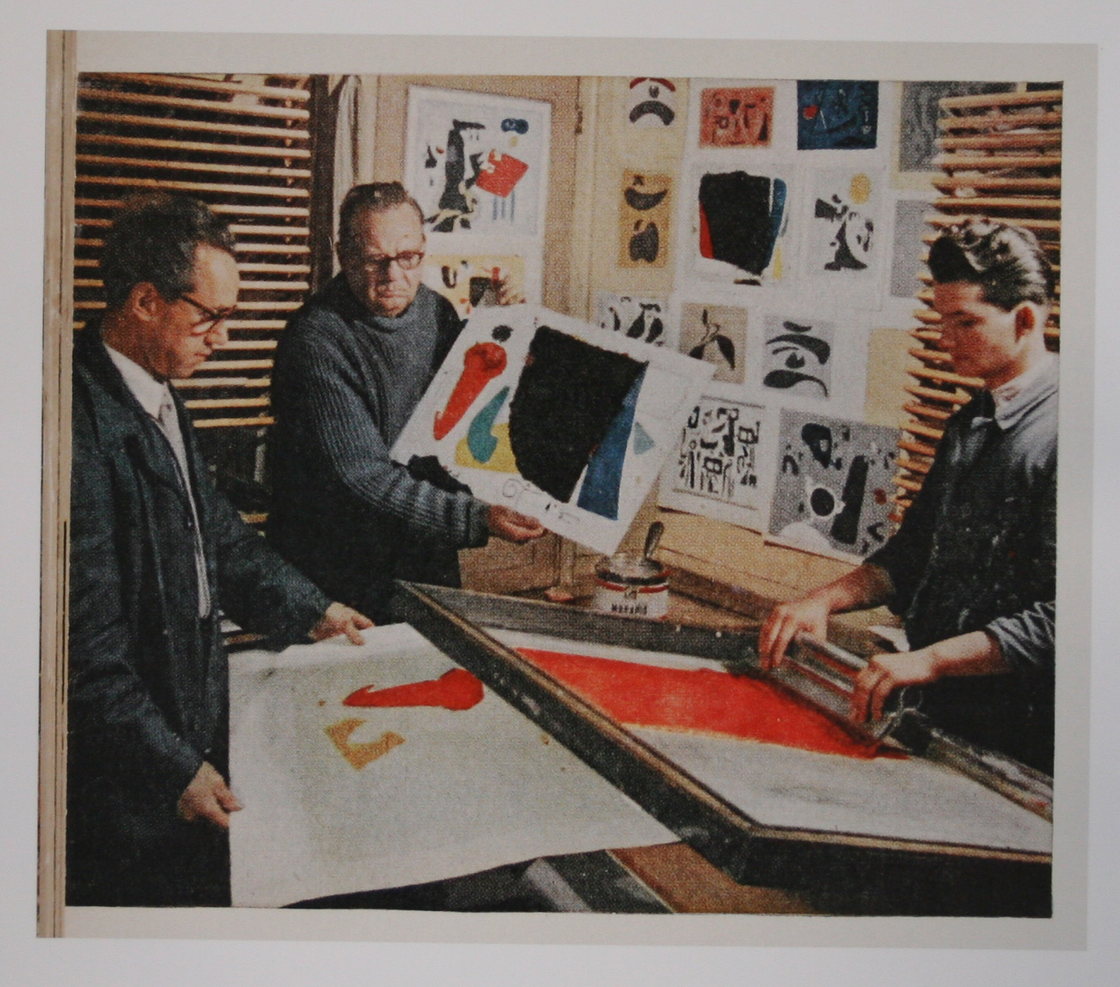
Willi Baumeister exclusively used the new medium manually and transferred drawing and paint onto the carrier himself. Concentrated handwork was necessary when he applied multiple colors – in so far as they did not overlap – onto the screen simultaneously.
In many respects, Baumeister’s silkscreen prints thus concerned the original graphic work in the narrower sense, because the artist himself prepared the print media, oversaw the strictly limited edition, and finally, signed and numbered the leaves meant for sale.
Artist and Hand Worker
Furthermore, an outstanding cooperation with the printer was essential. Baumeister found this in 1950 in Luitpold (Poldi) Domberger, who coincidentally had set up his workshop in the same ruin that housed Baumeister’s studio. Already in 1952 they exhibited the fruits of their collaborative work in the Hacker Gallery in New York.
For Willi Baumeister, the handcrafted always held – as we know from the origins of the first wall pictures and earliest typographical works – a great deal of importance. In his book “The Unknown in Art”, he wrote in 1947 that in the wake of the new evaluation of line and plane, the elementary-handcrafted underwent a renaissance within “high” art.
An Important Medium in Baumeister’s Production
Following the first eight leaves produced in 1950, the number of silkscreen prints in Baumeister’s oeuvre steadily increased. Prior to his death in August, he produced 18 in 1955 alone. At the same time, their total number noticeably exceeded that of the lithographs. This reveals that Baumeister’s intentions were chiefly realizable with the silkscreen print.
In terms of content we can establish – similar to the remaining graphic works and drawings – that he usually varied the motifs of his paintings and translated their content into the syntax of the silkscreen print. Only in the last works did he resort to drawings from the 1943 illustration series.
Translations of Earlier Paintings
Among the most important artistic results in Baumeister’s oeuvre of the 1950s are transfers of in part early sketches into paintings.
The serigraph enabled him to again grab hold of, expand, and optimize some his important formal inventions, whereby the latter had less to do with the sketch itself, than with the color, tonal effects, and clarity of the compositions.
The best examples include “Africa leaves” (1950, painting 1942), “Runner” (1952, painting 1934), “Female Dancer” (1953, painting 1934), “Diver/Jumper” (1954, painting 1934), “Ideogram” (1954, painting 1937), and “Chess” (1954, painting 1925!) as well as several leaves with motifs from the Gilgamesh series (1955, drawings 1943). Besides the new engagement with earlier motifs, Baumeister’s serigraphs often dealt with motifs from current paintings, such as “Phantom”, “Faust”, “Nocturne”, “Montaru”, or “Mo” and several works with the title “Aru”.
Not least of all Willi Baumeister helped establish the artistic serigraph as a recognized original graphic method. His 1952 postulate was fulfilled:
Further development is not ruled out and it is critical that the painter and graphic artist follow our method.“