Early on Willi Baumeister caused a stir as a typographer and commercial designer. In the 1920s and early 1930s, he contributed a great deal to the development of typography and commercial art in Germany and Europe, not only though his practical works, but also through his theoretical writings. These can be traced throughout three and a half decades of his work. Even so, these fields of activity were underestimated and disregarded until long after his death.
Directly after his return from World War I he made a name for himself not only as a painter, but also as a typographer, in addition to working as a stage designer for Stuttgart theaters, wall designer, textile and interior designer, even as a color designer of dance cafes and house exteriors. In 1948 he wrote his friend and biographer Eduardo Westerdahl: “I always had two activities, 1. typography, poster, stage, textile designs, and so on, 2. fine art with which I could consistently make modern art without compromises or concessions.“
Baumeister considered it important to not pit commercial art and the High Arts against each other. Up to the end he also encouraged his students to abolish the old tension between ‘free’ and ‘applied’ Art. For him, typography also always possessed painterly elements. Especially in the early years, but after 1945, too, he gave reign to his delight in these painterly qualities and by no means limited himself to one typeface even if he favored the Gothic type.
Experimental Beginnings
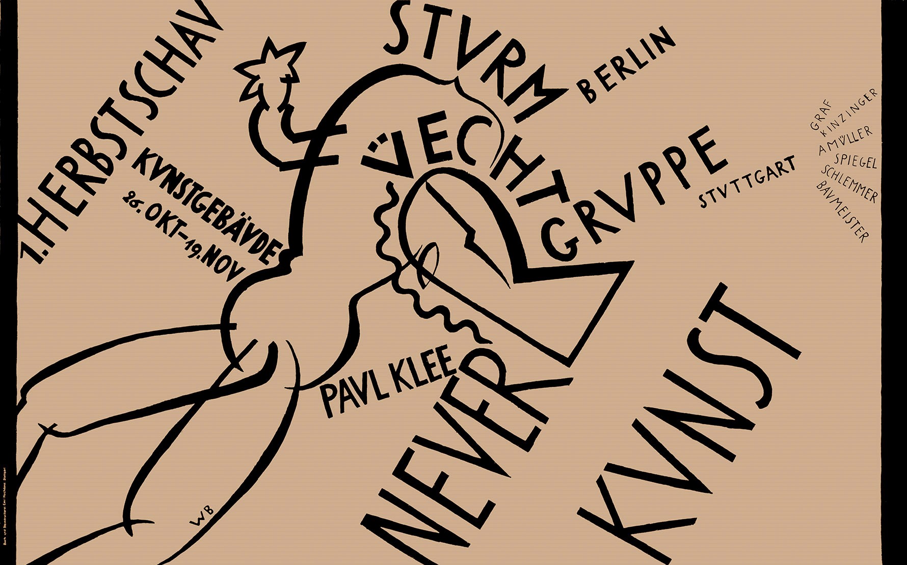
The 1919 poster for the Stuttgart “Üecht-Group” exhibition illustrates the radical break with an old, existing writing and advertising culture: text and picture interpenetrate one another as if Baumeister wanted to ring in the start of a new era with these media. Here he joined a series of many illustrators, such as Walter Dexel, Johannes Molzahn, and Kurt Schwitters.
These early works up to around 1924 still appear thoroughly experimental. The designs for the ‘Deutsches Theater’ and the ‘Sturm’ exhibition should also be mentioned here. Individual letters take on formal elements. In the poster for the ‘Stuttgarter Neues Tagblatt’ around 1925, planes are composed figuratively similar to his constructivist easel paintings of those years. Later, parallels between his commercial graphics and painting can hardly be found.
Giving Form to the Everyday Objectification and the 1927 Weissenhof Exhibition
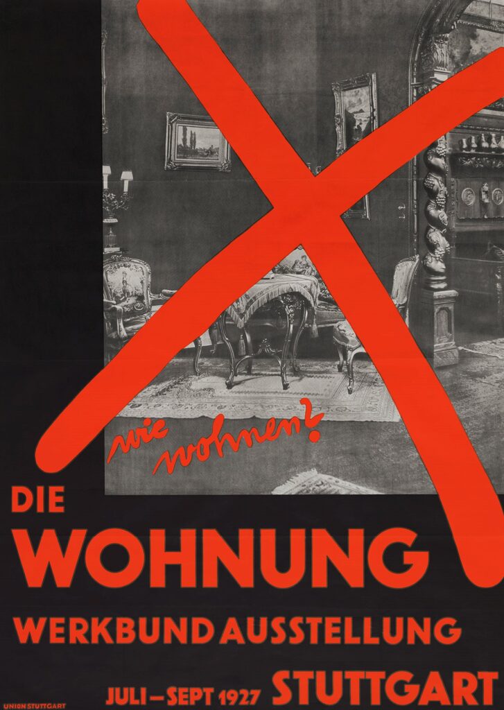
In the mid 1920s, though, Baumeister rapidly switched to an individualistic tendency toward objectification toward a functional typography that among other things led to his participation in the Stuttgart Werkbund Exhibition ‘Die Wohnung’ (The Dwelling) of 1927 with the famous Weissenhofsiedlung (Weissenhof Estate). The multiform printed matter that Baumeister produced for it demonstrates his typographical and advertising design abilities and his high standards, which he underscored at the time with a number of commentaries and publications.
Around this time, he also emerged with numerous articles and lectures to promote the establishment of new aesthetic norms. Analogous to the aims of not only the Werkbund, but also the Bauhaus, Willi Baumeister developed into one of the chief protagonists of a New objectivity (Neue Sachlichkeit) typography. Because the union of art (or more precisely, design) and everyday life was one of the main aspects of the Weissenhof Exhibition, Baumeister’s designs letterhead and invitation forms, adhesive stamps, envelopes, advertisements, and brochures were a highpoint in the development of function-driven graphics. The exhibition booths that he designed for individual firms are model documents of a new typography because the placard-style inscription was the most important element of their composition and effect. Never before had Baumeister been able to prove himself within the design of commercial graphics as during this exhibition.

Functionality and Process
Very early on Baumeister also included the element of process, of the chronological course of events, into his designs:
The established order is the symmetrical. The symmetrical composition of a printed page […] is nothing other than the decorating of a facade. The energy distribution of this composition distributes energies and tensions to both sides. […] This system does not provide a beginning and entrance for the eye. […] This composition in no way complies with reading. […] The introduction of the eye into the absolute planar system of the printed page can only take place by shifting the emphasis and, namely, after the beginning to […] the upper left. The richly decorated initials of old handwriting were functional and, for that reason, correct.“
Willi Baumeister
Professorship in Frankfurt am Main 1928
In 1927 Baumeister was one of the co-founders of the avant-garde Circle of New Commercial Designers (ring neue werbegestalter) with Kurt Schwitters and László Moholy-Nagy, among others, that propagated a number of elementary design principles. Above all, however, his Stuttgart success led to a professorship at the Civic Applied Art School (Städelschule) in Frankfurt am Main beginning summer semester 1928. In contrast to his later teaching activity, Baumeister was not engaged as a painter here, but taught in the area of commercial graphics, typography, and fabric printing.
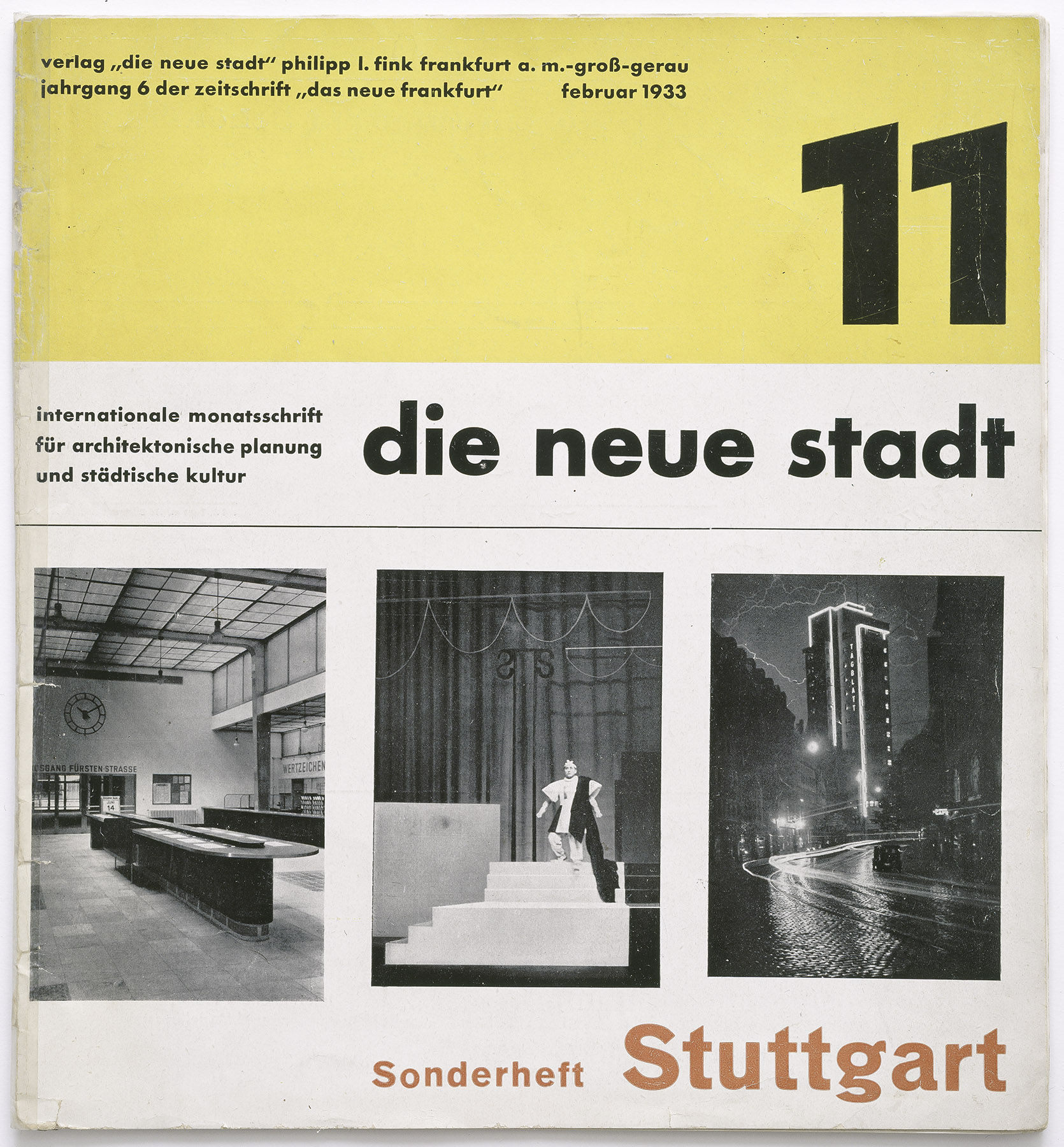
This period entailed many new tasks and obligations, so that little opportunity remained for his own graphic works. Among the most important works of these years were the title and typeface of the periodical ‘The New Frankfurt’ (Das Neue Frankfurt) later ‘The New City (die neue stadt) founded by Ernst May and banned in 1933. Here, Baumeister’s handwriting is clearly recognizable among the contrasting, partially collaged combination of photographs, text, and color planes.
Baumeister’s role as an instructor becomes clearer when we realize that he saw modern typography not as something subjective, but ultimately as something normative. In 1926 he published the essay ‘New Typography’ (Neue Typographie) in the journal ‘The Form’ (Die Form). There he mentioned Fernand Léger and Le Corbusier as elective relatives and stated: “Typography is ultimately based on the division of a discrete surface. The typographer faces […] the same task as the painter. The basic principles of surface distribution are different. The printed page contains pictorial and communicative components. In the poster, the pictorial predominates. In typography, the communicative is to be given form pictorially […].“
But his teaching position increasingly suffered from the political circumstances and a number of attacks from the Frankfurt press. With the beginning of the Nazi regime Willi Baumeister was informed without explanation on March 31, 1933 that his future teaching activity was being refused.
Baumeister was certainly considered ‘degenerate’ now, but initially not imposed with a ban on practicing his profession. Thus his activity as a commercial artist did not end with the dismissal. Up to 1936 he completed numerous commissions that show he was not ready to make any compromises.
Find additional information under Baumeister as Instructor.
The Wuppertal Years 1939–1944
During the war years overshadowed by doubt and economic insecurity between 1939 and 1944, Baumeister like Oskar Schlemmer was engaged in the study, research, and exploration of painting techniques at the Dr. Kurt Herberts Painting Technical School in Wuppertal. The Herberts enamel factory was ultimately the Camouflage that enabled some artists to continue painting away from critical observation.
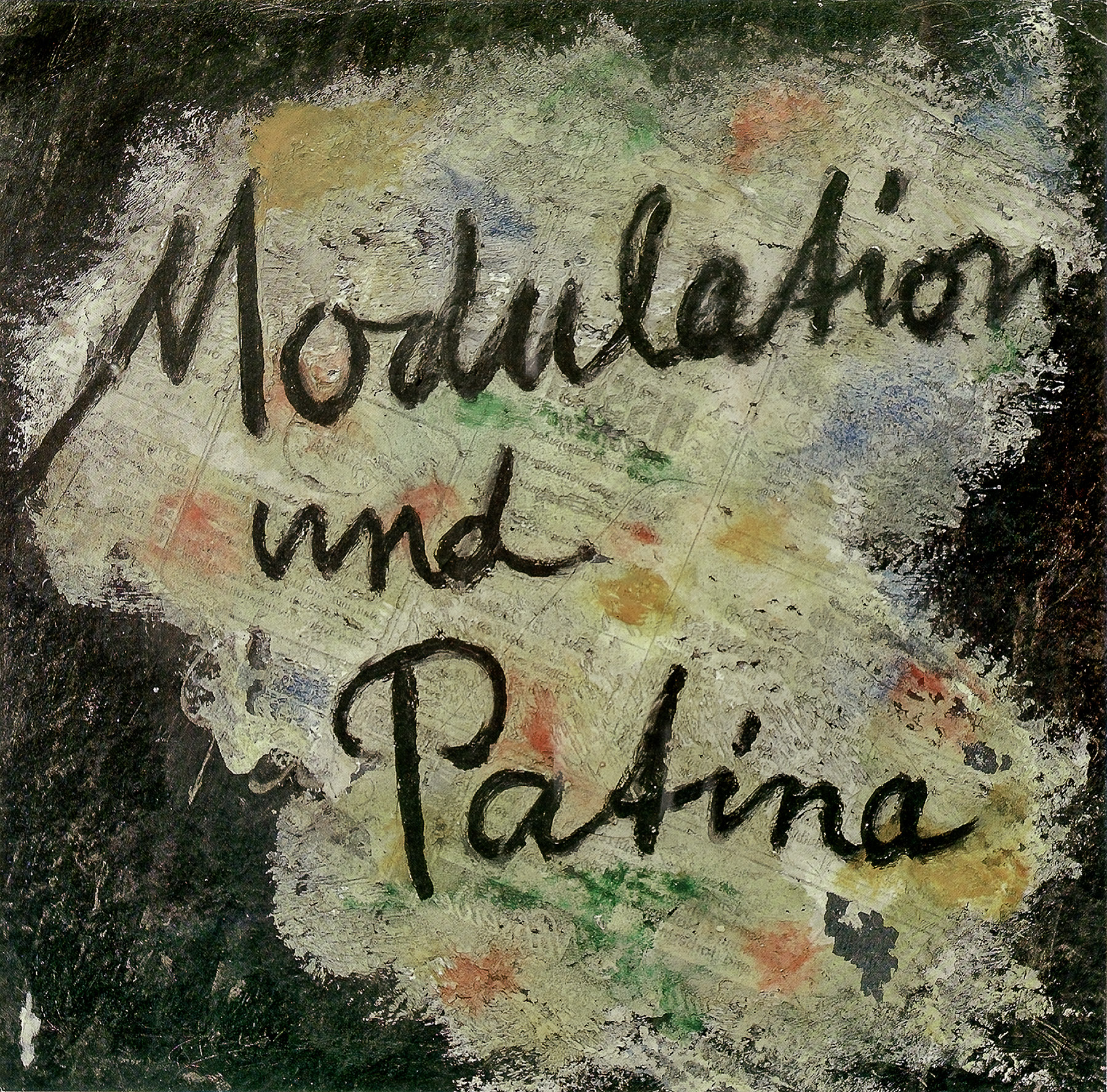
Baumeister’s activity chiefly consisted of giving graphic and editorial form to publications under Herberts’ authorship and supplying them with pictures, some of which came although anonymously from Baumeister himself. He gave essential character to two publications in particular: ‘Modulation und Patina’ of 1944, on whose cover a pasty application of putty appears, and Borne from Painting Technique of 1943–44, which depicts part of a Chinese scroll picture.
The Applied Arts After 1945
Baumeister remained loyal to typography even after the end of World War II despite his growing reputation as a painter of international rank, and despite his obligations as a college instructor.
He regularly designed exhibition posters and dust jackets alongside printed materials. He also turned attention to stage design. He no longer produced designs for the shop windows, fair booths, letterhead, or advertising that had made him famous in the 1920s, but, in that sort of totality that did not chose between the arts, he nonetheless remained committed to the Bauhaus idea.
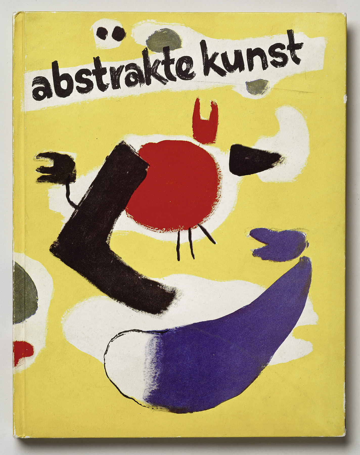
Clearly recognizable is that Baumeister post-1945 typography grew playful or freer again. The (painted or drawn) picture dominates in exhibition posters and book covers, and in contrast to the works of 1919, the alphabetic characters do not develop a life of their own. And as is understandable after the difficult years: in this freedom of design, Willi Baumeister’s function-driven graphics and paintings again come very close to one another!
Baumeister 35-year-long work in the field of commercial graphics holds its own next to the painting. Not just in his role as painter was the artist was a pioneer for subsequent generations. Also in the applied arts and in dealing with typeface, word, and sign he quite literally helped shape the 20th century.
In fall 1989 on the occasion of a Stuttgart Academy of Fine Arts exhibition commemorating his 100th birthday, the catalogue ‘Typographie und Reklamegestaltung’ (Typography and Advertising Design, see literature) appeared. Wolfgang Kermer’s introduction and Heinz Spielmann’s essay served as the bases for the text on this page.